
10 Mistakes to Avoid While Building Your Own Business Website
Planning to build a website for your business? It’s a good idea to develop an online presence for your business. But to start with, your situation right now might be similar to a guy standing in center of four roads going in four directions, thinking which the right direction is.
To get a business website up and running is very much daunting.
The reality is that if you weren’t a bit nervous about it, we would be worried. It doesn’t mean that you can’t do it. Of course you can develop a complete website as there are several tools that will help you. But it’s difficult to find out the right tool.
So, why did I say “we would be worried?” The reason behind you being worried is because your website plays a key role in the health of your business. It does multiple things for your business such as generates leads, drives conversions and builds your brand that help in your complete growth. However, it is similar to the first date when a lot of ways spoil it up.
“You might have hired a web developer and might be paying, right?”
Fortunately, to avoid “website don’ts” is much easier than to find love in a hopeless place. In this post, you are going to check the 10 biggest mistakes you could make when setting up a website for your small business. Make sure you avoid these pitfalls and get on the right track to turn visitors into devoted customers.
Don’t Fail To Make A Responsive Website
Almost all the beginners make this mistake. What is a responsive website?
In simple words it is a website that adjusts itself as per the environment to offer the best possible user experience to the users browsing it. There are multiple devices used by all and so when someone browses your website on them, its layout will be different as compared to the desktop.
As per the facts from Statista, in the first quarter of 2019, there was 48.71 percent of global website traffic generated via mobile devices (excluding tablets), constantly balancing around the 50 percent mark since the start of 2017.
As per Google, 61 percent of users that have trouble accessing a website on mobile are dubious to return. Out of those 40 percent will check for the competitor’s site instead. In case, you don’t create a responsive website Google will surely hurt your business.
So, the conclusion is that while selecting a website builder or platform to build your website, ensure if it offers responsive designs. Don’t mess around with a stagnant design that will take away your mobile visitors.
Not Customizing Your Theme
A content management system offers free themes to you just at your fingertips. As soon as you select your web hosting company and buy a domain, you can select the relevant theme that matches your brand in just few minutes.
Remember that whether you select any platform for your website building, you will need to customize it to meet your brand’s style. Or else your website will appear similar to the thousands of other business sites on the web and that would be a big mistake.
Using Jargon
We know that you have a great experience in your niche and you are the master of your industry. Though you know the terms “IPC”, “VC Money” and “apportunity” stand for but there’s a bad news that your website visitors don’t understand it.
In case visitors come on your website and the copywriting comprises of a complete technical terminologies that bounce they head, they will immediately leave your website. Don’t be in a misunderstanding that they will check for the meaning of those terms.
Remember, the average human has a shorter attention span in comparison to a goldfish which is just eight seconds. This means when customers land on your site, they need to get a copy that is straightforward and encourages them to take a quick action — whether that’s entering your sign-up flow, watching a video, or subscribing to an email newsletter.
To check a good example, Dropbox Business is the one that is the best when it comes to website design and simple copywriting. Check their homepage below:

• Their headline is straightforward without the use of any jargon.
• The subheading gives the information on their work in one easy-to-follow sentence. In fact, you get immediately cleared about what the company offers.
• The call-to-action is easy to see as well as click!
The conclusion is that your copywriting and design should be like Dropbox.
Not Thinking About Readability
Your copywriting needs to be sweet and simple as well as the design too has to be easy on the eyes.
Not just beautiful to look at it but also easy to read.
When you use a website builder, you can customize your website as per your preference but this doesn’t mean that you should avoid using with best practices. To ensure that your users don’t turn off with your design, you should follow these rules:
• Keep Your Font Sizes Consistent — Larger font sizes indicate that it is important, so pay attention. While smaller font sizes indicate that there is more in-depth information. When developing your website, don’t control and use different font sizes. Only use three or four sizes.
• Consider Your Fonts — When selecting font select the one that is readable on your website. For example, Papyrus may look best on the card of birthday party invite, but it won’t look great on your website. Fortunately, most website builder themes only use fonts that designers have already inspected for readability and looks. Take a note of one thing that the Sans-serif fonts — that appear without the extra little flourishes — are usually easier to read on the web.
• Choose Contrasting Colors — Similar is the case with colors. While selecting a color palette for your website, ensure the background images don’t drown out your font. Your main focus needs to be on readability.
The best example of readability is FreshBooks.
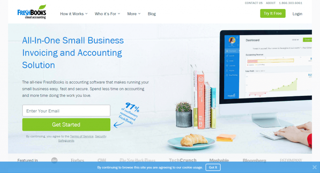
Its homepage doesn’t contain any jargon and is simple and straight to the point.
• Their content appears to be more robust as compared to the Dropbox example but it’s still easy to understand.
• Their color pattern is matching nicely with each other, and not a single of the image devaluates from the text.
• The messages that are important are displayed in larger font while the other information is in a smaller font.
Overall, the readability of this website suggests that it’s a money-based niche, which is good.
Falling For Search Engine Optimization Myths
It’s a dream of every new business owner to create a website that will rank on the top of the search results on all other search engines. Also, they hope to rank for multiple keywords.
But, the truth is that a good SEO strategy requires time, intelligence, and money. Additionally, it’s impossible to optimize your homepage for more than one keyword. The internet works in this way, and if you take shortcuts, Google knows where you stay.
Seriously, it knows.
One better way is to find the top keyword for your website and rearrange your content to rank for that keyword. Here are a few suggestions:
• Write Long-Form Content — Earlier stuffing your content with your top keyword helped in ranking you better in the search results. But today, you’ll be penalized for trying this thing. So, just write your content for the user. Make sure your content is highly comprehensive and helpful so that Google rewards you.
• Structure Your Content with Heading Tags — Heading tags are those with to <h1> to <h6> which are often ignored, but remember they matter a lot. Headings make your pages structured, so that, both readers and Google bots can easily consume your content.
• Add a Call-to-Action — Having a clear call-to-action (CTA) on your homepage helps a lot in gaining leads. It helps your readers to navigate in the right direction and take the action that you want them to take such as buy your product, sign up for your service, or subscribe to your newsletter. Also, it helps Google to focus on what is important to you.
For example, check the Moz blog that displays on-point optimization. Below are the things they are doing right:
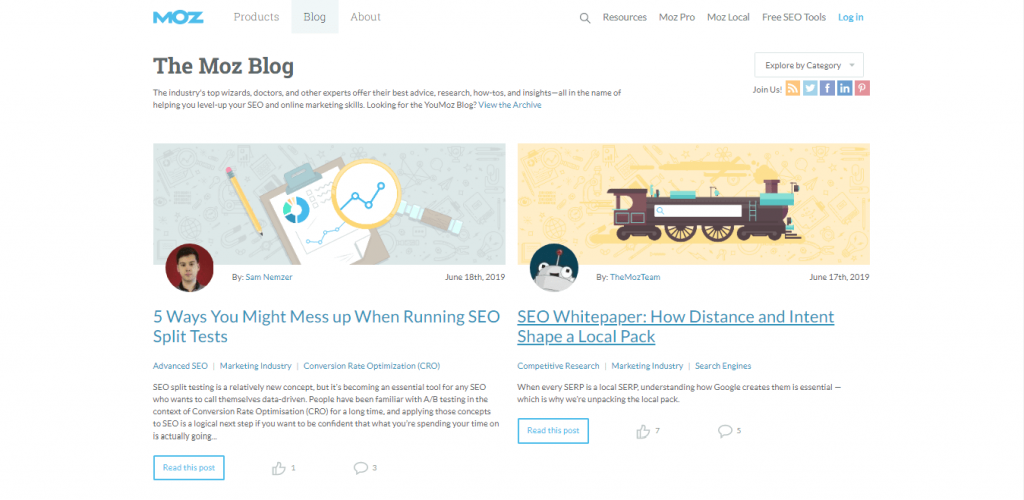
• Use of clear, strong heading tags in every post.
• Content is structured which makes it easy to follow, read, and scan.
• The posts aren’t stuffed with annoying keywords. Instead, there’s good use of H1 tag and is helpful to readers.
Going Pop-Up Crazy
You might have come across many sites that contain lot of pop-ups. How irritating those are? When a sign in form appears in front of your face, you can’t ignore it. But when there’s a whole bunch of sign up boxes in front of you, you can’t pay attention to any of them.
Your readers should be served with right pop-ups and this ultimately helps your business to grow. For example, use one pop-up that asks readers to take ONE of these actions: share a post, join your mailing list, follow you on social media, or sign up for an upcoming event.
But if there are multiple pop-ups displaying on your website for the same actions and many more, you won’t be serving your visitors or your business but unfortunately annoying them.
Don’t act in a stupid manner when implementing pop-ups. Find out which type of pop-up do you want your users to taken an action and then build it. Don’t build other pop-ups. It’s so simple.
Check the website of Digital Marketer, one of the marketing world’s top thought leaders. They are a great example of using pop-ups wisely. They are doing the below things rightly:

• It is an online publication that is followed by thousands of daily visitors. They use the pop-up in the image above for the subscribers to know about an upcoming event.
• When a subscriber has entered his information or opts out, the pop-up disappears.
• The visitors aren’t forced to take multiple actions from the subscriber pop-up.
You can use a pop-up on your website. Just don’t bombard your website visitors with pop-ups as they will feel as if being at a protest with mixed messages.
Slow Server Times
For your information, customers only wait four seconds for a site to load prior to jumping to another one, according to a study by Akamai Technologies. For keeping your customers engaged, you need to make sure your site loads fast.
There are some factors that can’t be controlled such as the device being used to access your website, as well as the speed of your visitor’s internet connection. It is important to increase your website accessibility as quick and easy as possible for your users to browse the content they need and so, some redesign might be essential. Check if your homepage really requires so much imagery or the introductory flash animation. Note that a page requires more time to load is a page that can be a major obstacle.
Don’t Exclusively Focus on Your Products or Services
No doubt your website is made to sell only a product or service but this will make it appear similar to other websites related to your niche. Want to stand different? Don’t build a straightforward website that just offers products or services as it will fail to differentiate from the competitors. What makes your website stand unique?
Focus on your branding, and don’t be afraid to introduce your personality into your web based enterprise. There might be a personal philosophy or a particular reason behind offering the product or service. Personalization makes your website offer a unique experience for the consumer.
Poor Navigation
There are around 7 billion global searches done on the internet in a day and websites that offer spontaneous navigation, gain more visitors and that too those that stay for longer time. In case you are un-able to help your visitors to get what they are looking for immediately, they might move to the competitor’s site.
Though you aren’t a professional, you can do a few simple things to make sure your design is instinctive for visitors:
• Use a Theme — You can easily create a winning website by using a website builder. In a website builder, you just need to choose a design that matches with your brand, add your content, and boom, you will have a well-designed website without any coding required.
• Stick to the Standard — Humans are habitual to many things. Also, we are taught that the vertical navigation should be on the left side of the page and horizontal navigation across the top of the page. To make it simple, keep your navigation standard.
• Don’t Overwhelm Users — You might want to include several links in your navigation bar. Wait, remember: less is more. Add links just to the basics such as About, Products, Services, Contact, etc. in your navigation menu.
Of course, there’s a good example for this and that is 4 Rivers Smokehouse. It has a sleek design and have done the below things rightly:
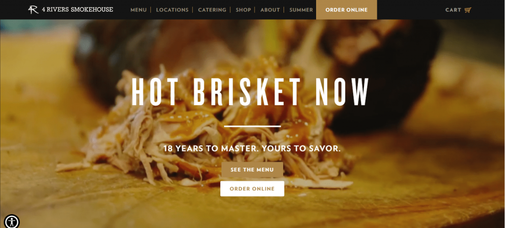
• Their navigation bar is located at the top and is simple and easy to read.
• You know what action to take immediately after visiting their home page with “See the menu” button.
• The website is designed in simple format and tempts you to dive into a plate of slow roasted brisket.
Outdated Information and/or Design
We just talked about brisket, but building a website isn’t similar to preparing slow-cooked pork. Simply setting your website up won’t bring you anything. You will need to update and maintain it regularly for a variety of reasons.
• Updated Information Helps Customers — In case your website contains outdated information, customers won’t be able to find you, order from you, and remain a loyal customer. So, see to it that you don’t leave them hanging!
• It Keeps Google Happy — Google has built several algorithms to rank websites. One of them to drive your rankings is that how fresh and robust is your site’s content? This means you need to frequently add new content to your site either via blog posts or any other posts. Also, make sure you routinely update your older pages and posts.
• Updated Design Keeps Your Brand Relevant — The tech world is innovating continuously, and to stay in the game you need to work on design trends and best practices. Here’s an example of how Google and Facebook, the world’s most popular websites, looked when they were first launched. Do you think they would have been successful if they never had updated their look and feel? Surely not!
Remember to keep your website updated as you continue to build and grow.
Last But Not the Least
When you are a beginner in website building, it would surely be difficult. Though many would find it easy via website builder but selecting a good one is very important. Lastly, just avoid all these mistakes while you are planning to build your website.